Information Architecture & Full Navigation Redesign
Executive Summary
As a project manager overseeing third-party research and leading design initiatives, I addressed user frustrations with system navigation through a comprehensive Information Architecture (IA) and New Navigation project. This transformation not only streamlined navigation but also provided theme options to mitigate subjective aesthetic preferences.
The impact of this initiative is significant: our users now navigate the system with expected paths and terminology, enhancing usability and user confidence. With the successful launch as default and sole navigation structure, we marked a pivotal milestone, enabling the sunset of legacy navigation and architecture.
User feedback has informed our decisions, with users praising the clarity, simplicity, and improved functionality of the new navigation interface. This project represents a substantial leap forward in enhancing user experience and product usability.
So far, so good. It's much smoother and easier to navigate.
Problem
Users found it cumbersome and difficult to navigate within the system.
People felt they did not possess the technical skills required to be successful using the system.
My Role
Project Manager for 3rd party UX research team, Lead Designer for layout and base theme, Manager of in-house UX Researcher, Lead Designer for evaluative UX research and iterative enhancements
Process
- Card sorting
- Tree testing
- UI/UX Design: Discover, Define, Develop, Deliver
- Partner with Engineering & Product Management to ensure design is feasible within constraints of architecture and effort capacity

Solution
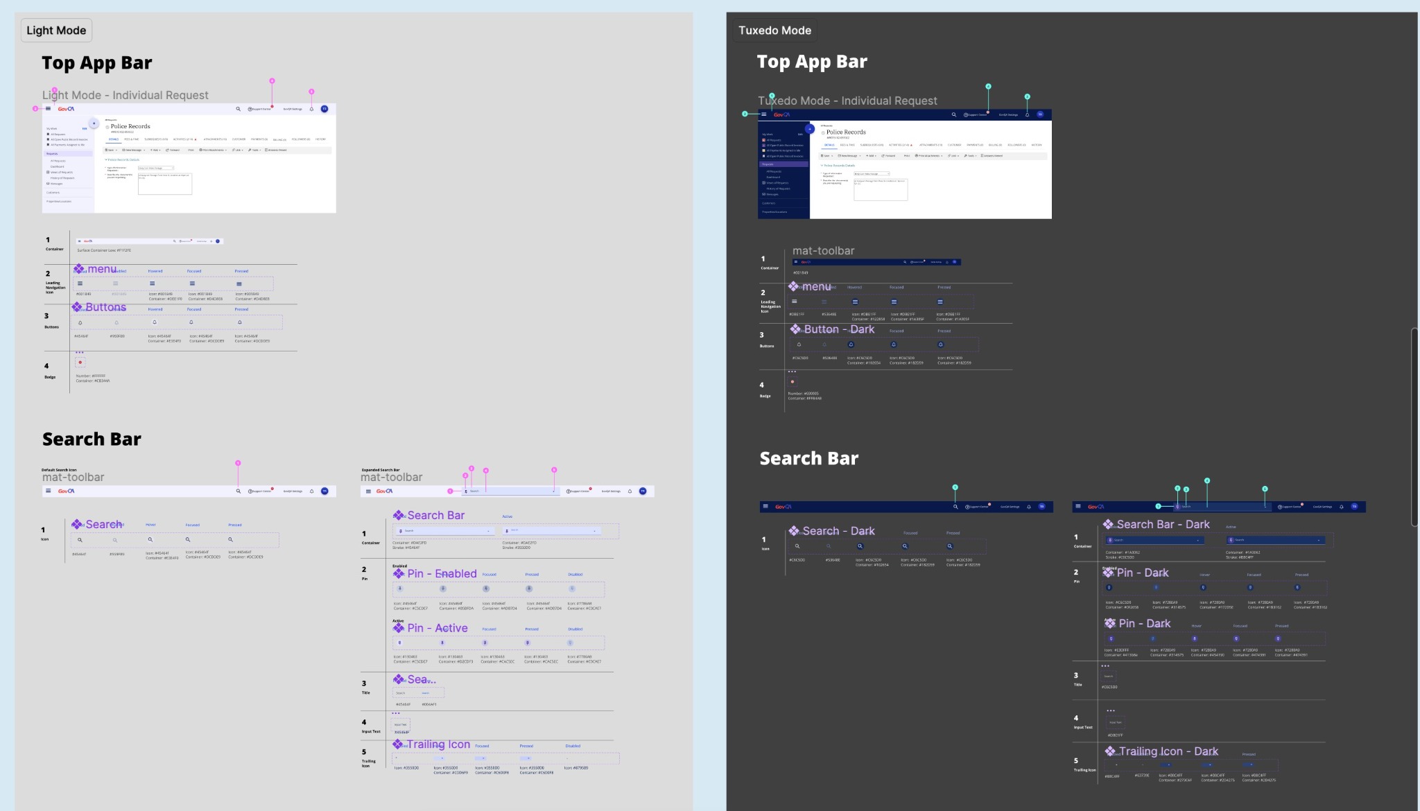
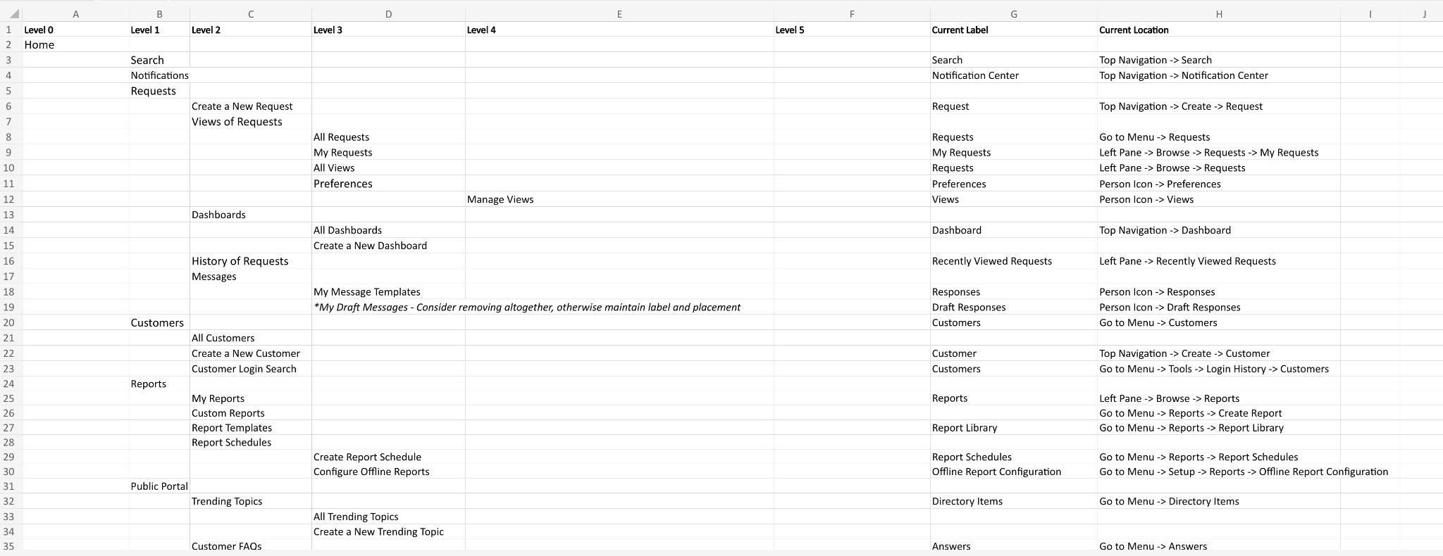
I followed familiar conventions by moving utilities to the top app bar, ensuring quick and easy access to essential features. Additionally, we introduced a range of new components designed to enrich user interaction and functionality, enhancing the overall usability of the system. To improve navigation clarity, I translated the new Information Architecture (IA) into intuitive navigation rails and drawers. After additional evaluatute research, we recognized the importance of user customization and implemented theme options to allow users to tailor their experience to better suit their preferences.
Impact
The main navigation provides our users with expected and preferred paths and terminology for the system's features and functionality. Our user's 'information scent' is supported, increasing ease of use and confidence
The new navigation has recently launched as the default and only navigation structure point-forward. This represents the largest-scale UX change in the product's history, and is considered a major milestone in that it allows us to sunset legacy navigation and related architecture.
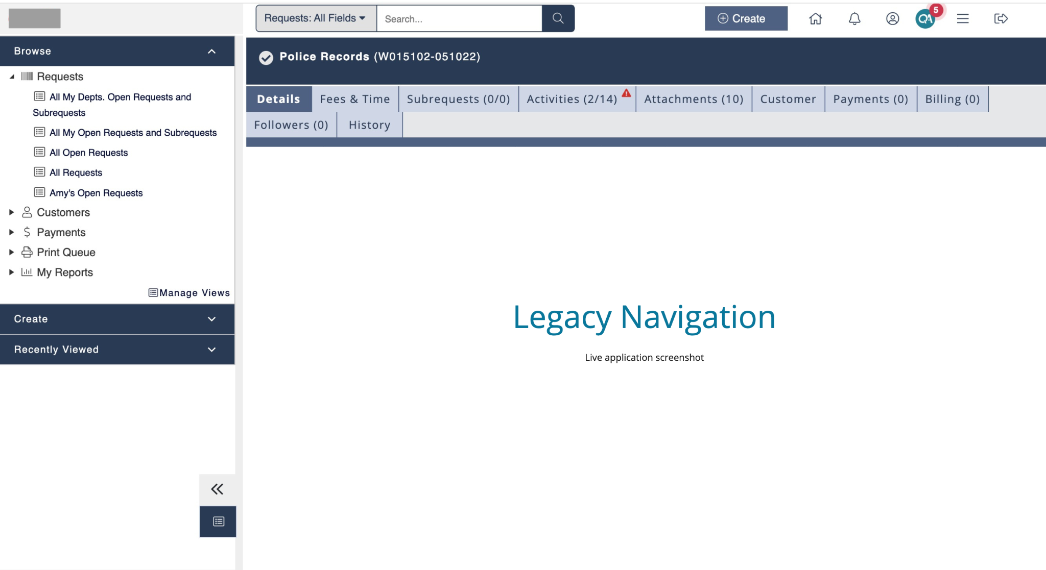
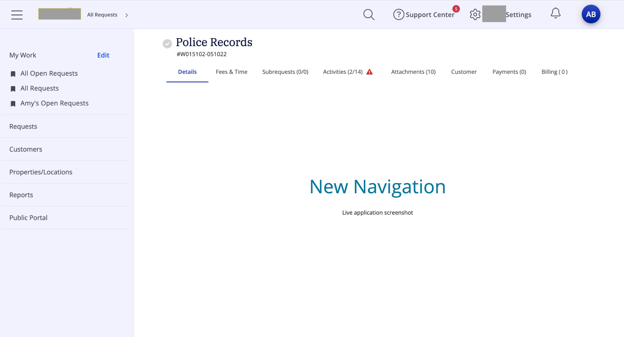
I like how clear everything is overall. It's more simple in a way and easier to read. Thanks!!
The entire platform looks very clean and easy to navigate
I like the fact that it's brighter compared to the other one and the functions are better as well.
The new Beta Navigation Interface is user friendly and I prefer using this navigation interface.
Post a comment